


🐦 a Birdseye view of your tweets
Explore your long-term topics and trends!

Ever wonder what patterns emerge from years of your tweets? What themes define your online presence? How did your interests shift and evolve?
I’ve been on twitter for a while and I’ve ALWAYS wanted a map of topics I post about.
Part of me believed seeing how my interests relate from above would fix me. And tbh it kind of did??

Figure 1: My tweet clusters. Notice the red blob in the bottom left is Portuguese language
I got my tweets from the community archive and did some data science on them. Then I built a simple interface to browse the tweets inside:

For someone who’s posted for as long as I have, it feels magical to see an index of all my passions, obsessions, projects and many discrete life events. And to be able to dive into them and explore underlying tweets.
It’s pretty cool to notice 2 classes of topics: isolated events, and persistent topics.
Spiky and isolated events:
I feel so grateful I got to look at clusters for Portal, for the 2 times I went to Vibecamp, or the time I tried hard to define Postrats.
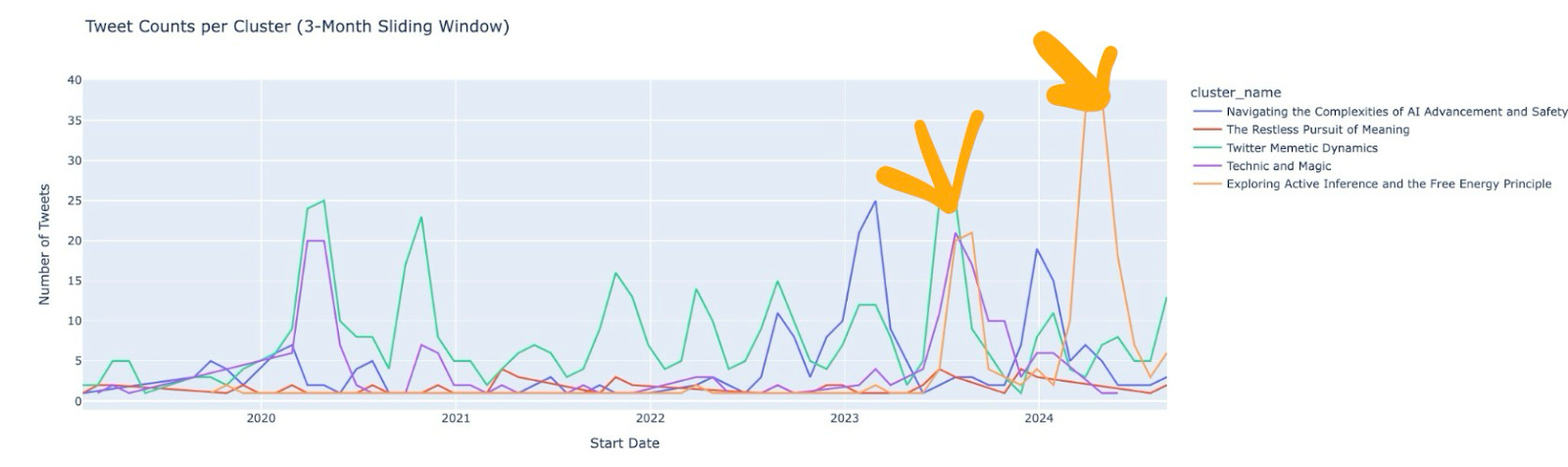
I like that you can see the 2 separate times I dove deep into Active Inference. And how cleanly the Threadhelper bump is separated from the Community Archive which came much later.


Recurring topics that persist over time:
It’s sweet to be able to explore how my meditation tweets grew over time, or my periodic writing efforts where I oscillate between intense periods and hibernation, or my log of anime I’ve watched.


It’s not perfect, but it’s really useful as an exploratory tool! I give more examples of insights in sections below.
🥳 Go check it out!!! 🥳
I originally wanted to sell this service as a way to fund community archive work.
However I think enough people have been donating on OpenCollective and it’s more fun to see everyone’s pages so I’m publishing it for free!!!
The community archive makes it really easy to access twitter data and do this kind of stuff, so I ran this for everyone who uploaded as of Feb 14 2025! If you’re in there, you can look at your Birdseye here!
The rest of this post is about the technical implementation, design, and product strategy. Try Birdseye yourself here!!
The Technical Part
There’s an obvious simple way to go about making sense of one’s twitter history. My plan was:
take every tweet of mine;
embed them, i.e. turn them into a vector of numbers;
cluster them, i.e. organise them in groups;
and ask LLMs to name the clusters!
For each account, I took all their tweets from the archive.
Some tweets are replies or quotes and only make sense in context, so I got threads and quote-tweets and enriched our tweets.

Then I went on the MTEB leaderboard, sorted by Clustering performance, and picked the best model under 1B parameters, which at the time was `dunzhang/stella_en_400M_v5`. Then I ran all the tweet texts through it and got a big n_tweets x n_dims array.
Then I clustered them using HDBSCAN, a hierarchical density-based clustering method.

And then sent Claude all the tweets in each cluster and asked it to name and summarize them.

I showed my notebook to my friend Andre Vacha (who helped with design in early stages)and he pointed out that there were too many clusters. I agreed. We needed to display them hierarchically somehow. Doing it naively with an LLM, he thought it was a delightful way to get to know someone’s body of work.
I especially liked plotting the frequency of tweets in each cluster. Below, you can see the two times I was deeply interested in Active Inference. My first encounter, and then the time I spent writing a blogpost.
I tried a few approaches to display clusters hierarchically, like clustering centroids, and even going into the intermediate steps of HDBSCAN to find higher level clusterings by cutting the single linkage tree higher.

This method works really well if you tune it manually, but I couldn’t find a reliable way to automate it for an arbitrary archive. So I sadly didn’t include hierarchy in the final app. Below you can see the real time slider for the linkage tree cut threshold.

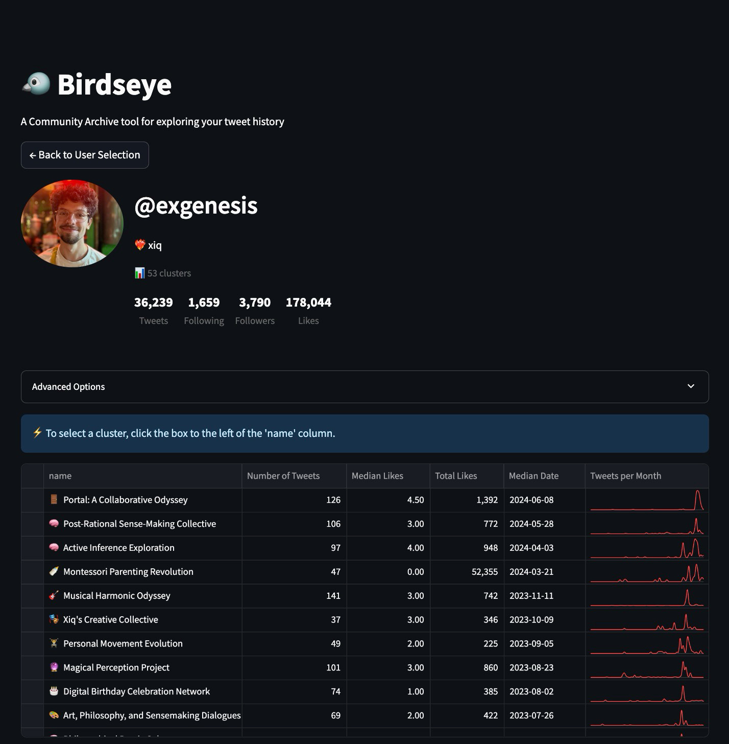
Balancing information density with a legible UI was also a challenge. Rather than a complicated hierarchical UI, I opted for a clean table with those sweet time series on the right, even if the number of rows can be a bit overwhelming. I added a median date column to sort by, which I think makes clusters more wieldy by sorting them mostly chronologically.
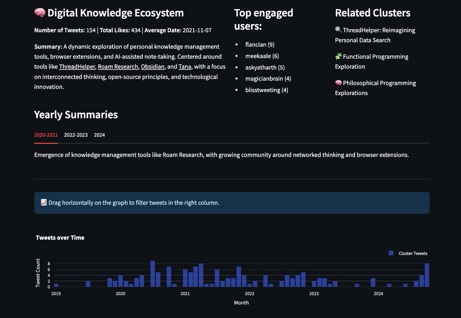
Analyzing clusters with LLMs
When you select a cluster, you get some stats, a summary, top engaged users, related clusters. You also get yearly summaries that give you a sense of how your story has evolved.
One other thing I wanted to try was to extract entities and stories from entire clusters, so I wrote an ontology and asked LLMs to fill them out.

The ontology manifests like this in the UI:

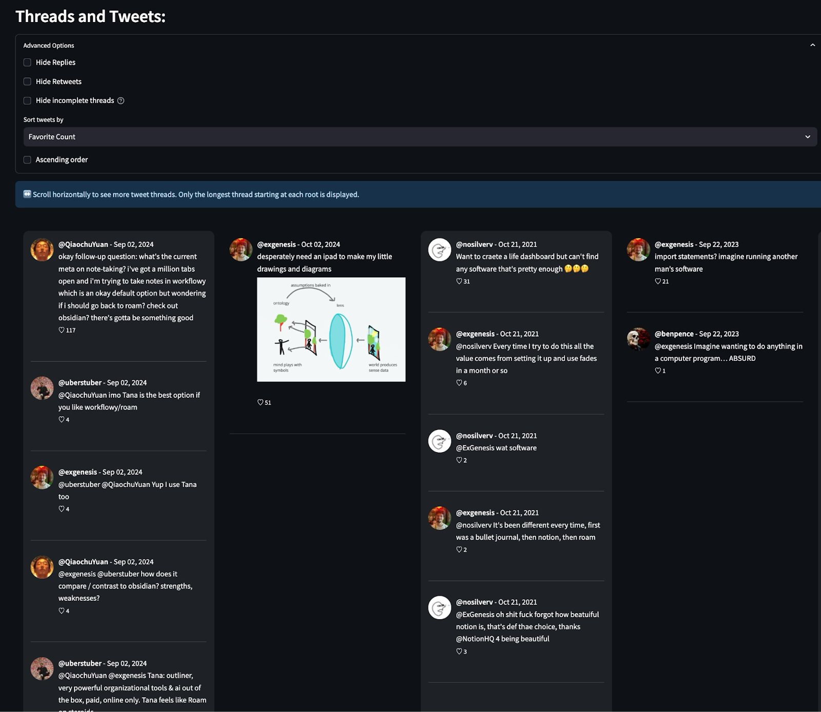
Finally, we can look at the individual tweets and threads that are part of any given cluster.
How is it deployed?
I’m doing this on Modal which basically offers serverless functions with GPUs. I’m using it to embed, cluster, and even host the UI. The dev experience is pretty slick and they offer $30/mo free credits! (not promoted)
Insights from using it
As mentioned above, there are 2 classes of topics: isolated events and persistent topics.
Isolated events:
I feel so grateful I got to look at clusters for Portal, for the 2 times I went to Vibecamp, or the time I tried hard to define Postrats.
I like that you can see the 2 separate times I dove deep into Active Inference. And how cleanly the Threadhelper bump is separated from the Community Archive which came much later.


Recurring topics that persist over time:
It’s sweet to be able to explore my meditation tweets over time, or my writing efforts, or my log of animes I’ve watched.
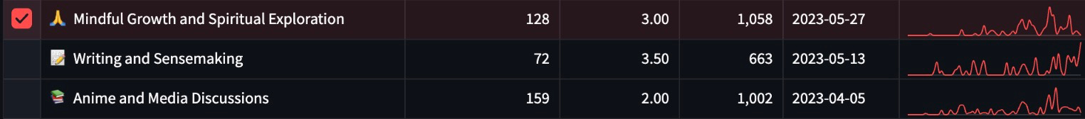
E.g. seems like I have periodic phases of intense writing, and then stopping and wanting to live my life instead:

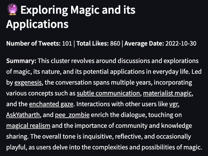
My magic cluster is really nice

I wonder how I was thinking about it in 2020 so I select only that hump in the timeline.

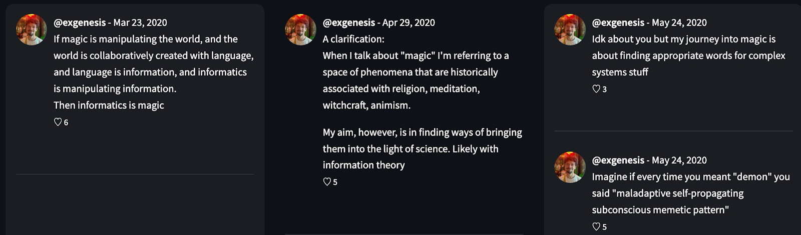
Cool to know where my mind was at :)
We also sometimes get meaningless high-volume buckets (ah well) - these are the largest clusters and I can’t find much meaning to them.

How do others feel about it?
Many people were as excited as I was to be able to survey their landscape of topics, and easily access
A line I got from some of the people I demoed to was “this is EXTREMELY COOL!!! What do I use it for?”. It wasn’t clear how to get value from this tool. For other people, it was really fun and moving to revisit their topics over time and rediscover stuff they didn’t even remember.
And like Andre said, it is a cool way to explore someone’s body of work.
Defender makes the excellent point that it would be cool to compare accounts, and made these pictures to illustrate:


It would be sweet to use the embeddings we have now to find people who talk about the same things and connect them if they aren’t yet in touch.
What did I learn from building this?
Even though I was conscious of time and wanting to go fast, I still let myself be drawn into rabbit holes like experimenting with different hierarchical clustering methods and the entity recognition - which respectively didn’t make it into the final product, and don’t usually add much to the experience.
I took extra time on this project because I thought I would be charging for it and so wanted it to be polished and user-friendly.
I also used streamlit because it’s really fast for prototyping UI and has some cute features like dataframe tables with in-row line graphs - but it’s just really unwieldy. It made it difficult to do third party logins, as well as payments, not to mention any slightly unconventional UI elements. I’ll use React for tools from now on.
Future Work
I’m not doing any more work on this project for now, but there are many things I would change or add if I could.
We could probably implement the manual sliding threshold for nesting clusters, even if not dynamically labeling the higher level clusters, just grouping base clusters would be nice.
We could also plausibly spend more inference compute to improve the quality of clusters, merge ones that are effectively about the same thing, and eliminate trash clusters more effectively.
I also learned that although people like reading about themselves, it can get a bit boring and self-centered. My new suspicion is that people really like learning about themselves in relation to other people, and I’d probably do something more socially focused or at least comparing profiles.
Finally, it feels like I went too “tall” for not enough benefit. I’m feeling more optimistic about “wide” moves like making archive-wide vector search generally available, or clustering in a more general open-ended way, and making it easy to export the results of these operations as text to paste in LLM context windows.
The Community Archive Flywheel
The Community Archive invites you to upload your tweets. Pooling everyone’s bodies of work lets us do hype data analysis, especially with LLMs.
There’s a flywheel where the more people upload, the more useful the data becomes, and the more useful the data, the cooler the apps we can build!

To fuel the flywheel I resolved to build a few experimental apps. I made this keyword trends app (imo an essential for quantitative memetics). Then I built Birdseye.
It demonstrates the sort of shiny thing we can build on the Community Archive!! A milestone on the way to a Bloomberg terminal for memetics, or a nooscope.
Gratitude
Thanks to Andre Vacha for advising on design, IAimForGOAT and DefenderOfBasic for frequent feedback in the discord. RhysLindmark, Ivan Vendrov, Maciek Laskus, Chris Lakin, Leo Guinan, Moritz Bierling, nosilverv, dpinkshadow AskYatharth, bvalosek, for testing and feedback as users.
This is so cool!! Reminds me of a small project I did a couple of years ago with tweets and sentiment analysis, but this is way more sophisticated and useful. I also think that being able to check out your own trends like this is really interesting and can be insightful. I particularly liked how you used LLMs to generate summaries, and creating an ontology with all this data is particularly interesting. Will you upload the code for this to github? I’d love to have a look at how you did it in detail!